ShopDreamUp AI ArtDreamUp
Deviation Actions


Suggested Deviants


Suggested Collections


![Caelthar [CM]](https://images-wixmp-ed30a86b8c4ca887773594c2.wixmp.com/f/2b8c5a5e-2c52-4917-b581-6ac794b71586/dcf3wni-d5e96ef4-80ff-4b12-8dc8-8a747d367a9e.png/v1/crop/w_184,h_184,x_0,y_19,scl_0.184,q_70,strp/caelthar__cm__by_minerea_dcf3wni-92s-2x.jpg?token=eyJ0eXAiOiJKV1QiLCJhbGciOiJIUzI1NiJ9.eyJzdWIiOiJ1cm46YXBwOjdlMGQxODg5ODIyNjQzNzNhNWYwZDQxNWVhMGQyNmUwIiwiaXNzIjoidXJuOmFwcDo3ZTBkMTg4OTgyMjY0MzczYTVmMGQ0MTVlYTBkMjZlMCIsIm9iaiI6W1t7ImhlaWdodCI6Ijw9MTQwNiIsInBhdGgiOiJcL2ZcLzJiOGM1YTVlLTJjNTItNDkxNy1iNTgxLTZhYzc5NGI3MTU4NlwvZGNmM3duaS1kNWU5NmVmNC04MGZmLTRiMTItOGRjOC04YTc0N2QzNjdhOWUucG5nIiwid2lkdGgiOiI8PTEwMDAifV1dLCJhdWQiOlsidXJuOnNlcnZpY2U6aW1hZ2Uub3BlcmF0aW9ucyJdfQ.srjj2AQginc1d88fPnDio7XRDR5n3Nzgm_Z6LnKgaG8)
![Caelthar [CM]](https://images-wixmp-ed30a86b8c4ca887773594c2.wixmp.com/f/2b8c5a5e-2c52-4917-b581-6ac794b71586/dcf3wni-d5e96ef4-80ff-4b12-8dc8-8a747d367a9e.png/v1/crop/w_92,h_92,x_0,y_9,scl_0.092,q_70,strp/caelthar__cm__by_minerea_dcf3wni-92s.jpg?token=eyJ0eXAiOiJKV1QiLCJhbGciOiJIUzI1NiJ9.eyJzdWIiOiJ1cm46YXBwOjdlMGQxODg5ODIyNjQzNzNhNWYwZDQxNWVhMGQyNmUwIiwiaXNzIjoidXJuOmFwcDo3ZTBkMTg4OTgyMjY0MzczYTVmMGQ0MTVlYTBkMjZlMCIsIm9iaiI6W1t7ImhlaWdodCI6Ijw9MTQwNiIsInBhdGgiOiJcL2ZcLzJiOGM1YTVlLTJjNTItNDkxNy1iNTgxLTZhYzc5NGI3MTU4NlwvZGNmM3duaS1kNWU5NmVmNC04MGZmLTRiMTItOGRjOC04YTc0N2QzNjdhOWUucG5nIiwid2lkdGgiOiI8PTEwMDAifV1dLCJhdWQiOlsidXJuOnNlcnZpY2U6aW1hZ2Uub3BlcmF0aW9ucyJdfQ.srjj2AQginc1d88fPnDio7XRDR5n3Nzgm_Z6LnKgaG8)


You Might Like…


![Dangerous beast (Commission) [sfw]](https://images-wixmp-ed30a86b8c4ca887773594c2.wixmp.com/f/3f1a77fc-0a29-43de-88a6-bf05ff788ddd/dc1z1vt-4f4eaf15-8144-4d8c-82ba-47e922d5a69c.jpg/v1/crop/w_184,h_184,x_36,y_0,scl_0.34074074074074,q_70,strp/dangerous_beast__commission___sfw__by_ziuki_dc1z1vt-92s-2x.jpg?token=eyJ0eXAiOiJKV1QiLCJhbGciOiJIUzI1NiJ9.eyJzdWIiOiJ1cm46YXBwOjdlMGQxODg5ODIyNjQzNzNhNWYwZDQxNWVhMGQyNmUwIiwiaXNzIjoidXJuOmFwcDo3ZTBkMTg4OTgyMjY0MzczYTVmMGQ0MTVlYTBkMjZlMCIsIm9iaiI6W1t7ImhlaWdodCI6Ijw9NTQwIiwicGF0aCI6IlwvZlwvM2YxYTc3ZmMtMGEyOS00M2RlLTg4YTYtYmYwNWZmNzg4ZGRkXC9kYzF6MXZ0LTRmNGVhZjE1LTgxNDQtNGQ4Yy04MmJhLTQ3ZTkyMmQ1YTY5Yy5qcGciLCJ3aWR0aCI6Ijw9OTYwIn1dXSwiYXVkIjpbInVybjpzZXJ2aWNlOmltYWdlLm9wZXJhdGlvbnMiXX0._gmmunNrLmwVrOJU0PuGccrRTx4JKRUeBb0e3_T6pyY)
![Dangerous beast (Commission) [sfw]](https://images-wixmp-ed30a86b8c4ca887773594c2.wixmp.com/f/3f1a77fc-0a29-43de-88a6-bf05ff788ddd/dc1z1vt-4f4eaf15-8144-4d8c-82ba-47e922d5a69c.jpg/v1/crop/w_92,h_92,x_18,y_0,scl_0.17037037037037,q_70,strp/dangerous_beast__commission___sfw__by_ziuki_dc1z1vt-92s.jpg?token=eyJ0eXAiOiJKV1QiLCJhbGciOiJIUzI1NiJ9.eyJzdWIiOiJ1cm46YXBwOjdlMGQxODg5ODIyNjQzNzNhNWYwZDQxNWVhMGQyNmUwIiwiaXNzIjoidXJuOmFwcDo3ZTBkMTg4OTgyMjY0MzczYTVmMGQ0MTVlYTBkMjZlMCIsIm9iaiI6W1t7ImhlaWdodCI6Ijw9NTQwIiwicGF0aCI6IlwvZlwvM2YxYTc3ZmMtMGEyOS00M2RlLTg4YTYtYmYwNWZmNzg4ZGRkXC9kYzF6MXZ0LTRmNGVhZjE1LTgxNDQtNGQ4Yy04MmJhLTQ3ZTkyMmQ1YTY5Yy5qcGciLCJ3aWR0aCI6Ijw9OTYwIn1dXSwiYXVkIjpbInVybjpzZXJ2aWNlOmltYWdlLm9wZXJhdGlvbnMiXX0._gmmunNrLmwVrOJU0PuGccrRTx4JKRUeBb0e3_T6pyY)


Featured in Groups

Description
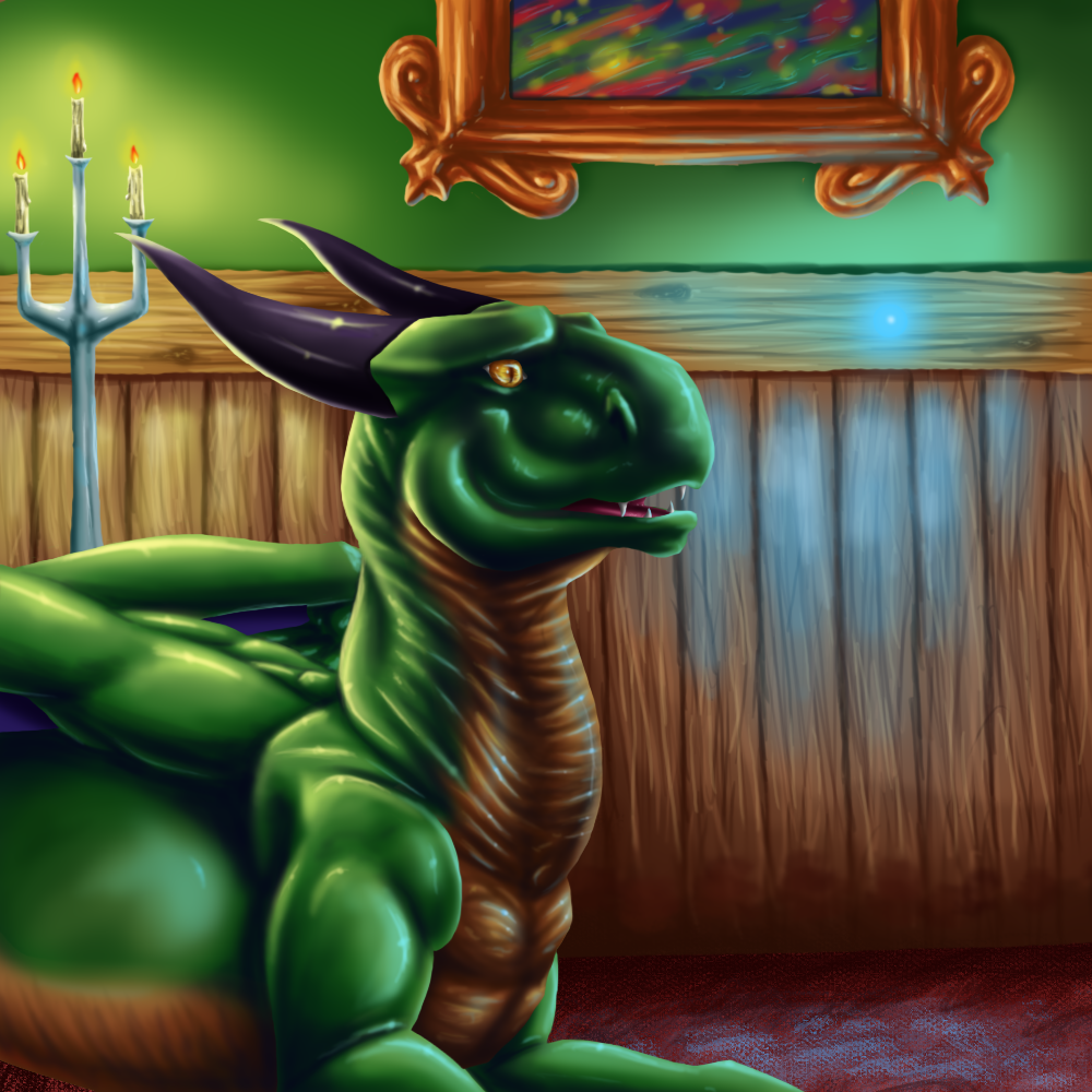
yayz moar detailed backgrounds....
look at the painting in the corner! avoid the candlething.
moar glowy for multiple light sources (Smile) - :)")
crits anyone?
doodle (C) me
look at the painting in the corner! avoid the candlething.
moar glowy for multiple light sources
crits anyone?
doodle (C) me
Image size
1000x1000px 884.13 KB
© 2010 - 2024 Draconigenae666
Comments47
Join the community to add your comment. Already a deviant? Log In
Man, you've been improving so much! <img src="e.deviantart.net/emoticons/w/w…" width="23" height="15" alt="
One thing I would avoid though, is not to add too many white highlights. Be selective in where you put them. (less is more)
And one more thing you could use in the future is more shadows. I feel like your pieces are too bright. There's too much of a wash-out from the candle.
It would also be nice to see a shadow being cast in front of the dragon. :3
I like how there's two light sources. The blue highlights on the picture frame are my favourite part of this picture.
Other things I like about this is the texture of the wood. <img src="e.deviantart.net/emoticons/a/a…" width="15" height="15" alt="
But it stands out a little too much from the smooth wall.
You did really well! I can't wait to see the next one of your "practices" <img src="e.deviantart.net/emoticons/w/w…" width="23" height="23" alt="